Blog
Nostalgia Drives 2019’s Vintage Packaging Trend
Consumers Craving Vintage
If there is a new trend that’s taking the marketing and advertising industries by storm, it’s the sudden return of vintage packaging. Vintage wasn’t, until recently, considered fashionable, except on fashion runways where the 20th century is a constant influence. But this is changing quite fast. And the reason is simple: customers crave vintage in 2019.
Manufacturers are already on top of it, and as a result, vintage is everywhere now, right from mix recipes in bars to seemingly ancient microbrewery beer varieties to the music influences being used in new TV shows. Even new ad campaigns feature vintage-themed slogans and endless references to vintage, as do new car models.
The trend has since been taken on by the food and drinks industry, and mostly through packaging. Today, all major food and beverage companies are touting many products with labels and designs that scream retro and early 1900’s.
But what’s the catch?
A Reflection of Quality
Does vintage packaging produce results? Quarterly earnings from many food companies say yes. Vintage branding does sell, both online and in physical stores. The reasons for that are noted below.
It conveys authenticity.
It’s part of human nature to want authentic goods only, probably because we believe they are good quality and we won’t be spending on them good. Vintage packaging conveys so much authenticity because of its older-looking fonts and designs, the kind of authenticity that stirs nostalgia in a customer and suggests good workmanship and top quality.
Vintage commands respect
Vintage packaging, when done right, has the ability to command respect among buyers that see it on a shelf. By its nature alone – detailed design with structural references that tell a story – vintage design inspires the buyer to think about the passion, tradition and values that could have gone into making the product.
Vintage also suggests preciousness and possible scarcity, as many vintage items are rare and precious. Inspiring such emotions among buyers is a direct catalyst to more orders and engagement.
Vintage promises quality.
We always associate vintage with quality service, partly because of good experiences with older, non-existent brands but also because vintage suggests expert workmanship that isn’t influenced by capitalistic gains. Vintage packaging reassures the buyer that they’re making the right choice, the only choice, the product that’s been popular for hundreds of years because of its good quality.
Vintage is beautiful
The ultimate requirement for any design order for a package is that it must be beautiful because that’s what catches the eye. There are lots of design themes that are popular today, including minimalism, black/white palettes, lines and more, but vintage easily stands out because of its fonts and designs. That kind of beauty is always appreciated by consumers, and partly explains the trend’s growth in popularity.
How To Achieve a Retro Aesthetic
The retro aesthetic is in vogue now more than ever, and because of its eye-catching abilities and its market appeal, companies are falling over themselves to repackage their next products before the trend is out. If you’re a designer or in charge of design, achieving a retro aesthetic is easy. There are a few bits to consider below.
Use a variety of design features
The first aspect that comes to mind when one considers vintage packaging is usually the font to be used because we easily associate fonts with vintage. But there are many more design features you can employ to get the perfect vintage packaging look.
The font
A few fonts are always known in the design world as vintage fonts because they’ve been in use for decades. Some of them, including Jack Daniel’s, Empress, High Ball, Vintage monogram and Braun are still popular choices for product packaging.
You might also consider manuscript lettering for your font, because it’s getting increasing traction for vintage packaging because of its old-time feel. You can also consider checking out old-time typefaces for inspiration.
The illustrations
Packaging designs in the early centuries could be wordy with blocky fonts but many of them also featured illustrations that were meant to make the product’s purpose easier to understand.
The use of illustrations hasn’t faded away completely, but in recent years it has been sidelined by the advent of themes like minimalism that require less to say more. For a proper vintage look, consider bringing back old-time illustrations to your packaging. You can use online references for inspiration.
The color schemes
Retro color schemes have always been associated with vintage, so you won’t go wrong getting your inspiration from there. There’s an element of duller, paler hues even for the brightest colors in vintage design, the elements that suggests age and simpler design, so remember to consider that.
Use natural looks
Apart from vintage fonts and old-time color schemes, the actual feel of a product’s packaging is essential in generating the authentic but high quality feel you’re searching for.
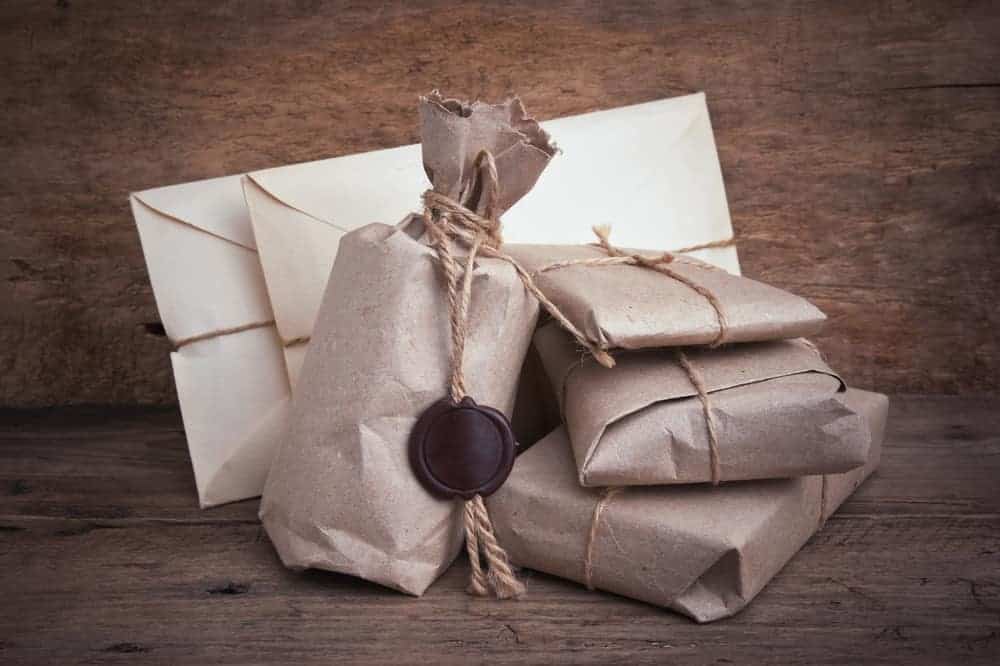
Almost every old packaging you can come across today looks green-brown, moldy and flimsy, immediately prompting ‘vintage’ in your head. That’s why some companies today ‘brown’ their packages or use old leather – to inspire the vintage feeling.
So how do you achieve the vintage feel on your product’s packaging? Experts recommend going for weathered looks and for heritage materials, mainly for their ‘aged’ aesthetic. A ‘browned,’ overused-looking packaging can be created without foregoing durability and quality. The same applies to the use of heritage materials, which can be achieved without going over the budget.
Take advantage of new advanced processes.
Packaging from centuries ago was put together using designs from printing presses and the few packaging materials that were available (read glass, wood etc.) Today, the processes have improved to make design easier, so you can still achieve a weathered look with old-time fonts without affecting durability or health of the user.
Conclusion
If you haven’t considered vintage packaging yet, know that it’s already a hot trend and one that sells. Vintage designs give your product more than just authenticity and oomph; they also draw buyers and capture their attention. That’s ultimately what you any marketing campaign needs.

