Blog
What We’ve Seen: Packaging 2016
Dec
On the cusp of a new year with new trends being lined up for 2017, it is both insightful and nostalgic to look back on the major trends of 2016 in the packing industry. If you were to summon a clear image of what a quintessential package would look like in 2016 a few different key aspects would pop up. What would easily sum up the average customer, is simply they were overwhelmed, by choices, by designs, by words. In response, many companies went minimalistic. Simple, to the point, with all the essentials you need clearly displayed. There are three main trends for us to dissect and project into the future of packaging to help you look back on your most successful packages and also to begin a new year design. First, we will look further into simple and essential designs, then the 21st-century throwbacks to old forms and designs, and finally perhaps the most important feature is the durability of the bag to optimize shelf life.
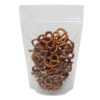
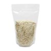
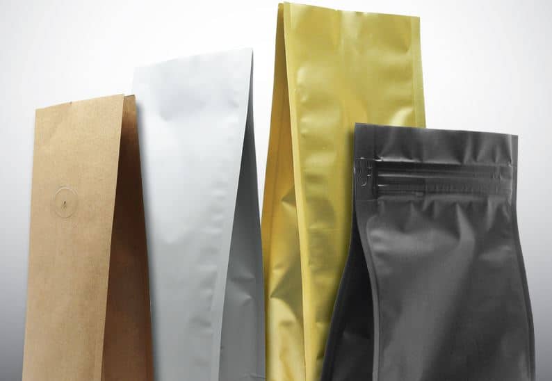
When walking through trendy stores or even finding yourself in the coffee aisle of your local supermarket, you may notice that packages have gone from bright characters, bold and full of detail to monochromatic shapes and styles. There are few details on the bag other than what the producer has deemed essential. For coffee, you might find words like local, organic, fair trade, and then simply the company’s name and the type of roast. Turning the package over will give you the same minimalistic feel. These simple packages are often accented with a geometric design of some sort, whether it is the logo itself or just a pattern printed to get a little more attention. This is a reflection of what customers are looking for in many markets, in both fashion and marketing simple has risen to the top. While this may seem like an easy accomplishment, many of us in the packaging industry know that perhaps stating your company’s purpose and intention in just a few simple words or a logo can be a huge challenge. How does one articulate their company’s passion and purpose with a geometric pattern? What we have seen come about as the answer in 2016 is to get right to the heart of your product, articulate it, and eliminate everything else. Tylenol Care+ came up with a simple model of this type of packaging. Their packaging is quite simple, and their different types of medication advertised in I statements: “I have a fever” reads one red bottle. This simple packaging makes a clear statement, gets to the heart of what the customer is looking for and it takes them less than a minute to read over, making it the perfect “essentials only” bottle.
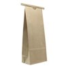
In the same vein as simpler, some have interpreted customer trends to lead to simpler times, and throwback designs boomed in packaging. Chalkboards, old fashion fonts, and vintage shapes draw in customers looking for basic ingredients and a personality to their brand. In the same since these old fashion designs give the look of person to person interaction through a brand name and style. Using wiggly looking fonts that simulate handwriting on a package gives it an old fashion home made feel. Even the graphics can be made to look like whimsical doodles made by the creator of each individual brand. This humanness connects with your customer and starts a story for your brand before they even pick it up off the shelf. This aesthetic has been wildly popular in foods, alcohols, and even soaps. The retro look is still minimal, providing the information that is absolutely necessary without going overboard. If your brand fits in with this description, then perhaps this style of packaging will be popular with your customers.
What is perhaps the most important trend to packaging in 2016 has to do with both its aesthetics and its durability. Shelf-life used to mean heavy duty packaging with unattractive designs that were meant for long use. The lack of design and large cumbersome bags would often mean those products, while a staple in a home, would be hidden from sight. However, as more packages become easily disposable this trend picked up of making both keepable and appealing packaging for products. The combination of excellent material and catchy designs means that your package will be proudly displayed in the customer’s home, not only increasing their love for your brand but also generating new eyes every time someone walks through their home. No longer will your long-term product be stuffed in the back of a cabinet. A perfect example of this is what is often a taboo in packaging, the Honest Company creates organic toiletries that are brightly colored boxes meant to last, but have beautiful simple aesthetic designs. These boxes have funny quotes and tips and are created with simple white backgrounds and pastels. Meaning their owners are likely to keep these boxes out in the open, rather than hidden underneath the sink.
Overall, what we see in 2016 is very optimistic about new trends in the upcoming year, and will challenge all designers to simplify their messages, develop a strong brand personality and really play with colors to get packages noticed. In turn, assessing your products and packaging material to increase shelf life without sacrificing the aesthetic appeal will be essential. Whether you are producing foods or coffee or even cleaners, you are going to want a simple clear message and a package the speaks durability to the customer. Many of these trends will continue to develop and grow in 2017, so as you sit down with your designer consider penning out a few of the keywords and descriptions that you think summarize your brand. Keep going until your narrative is there, and then whittle down your message to a few key words or graphics that help a customer understand your brand if they were just to pass by. Human-to-human connection for both 2016 to 2017 is going to be the best things to focus on when you are developing your packaging strategy.